
Design Simple Slides
15/09/08 20:24 Filed in: Presentations
Nothing drains the life out of a presentation faster than a steady stream of slides filled to overflowing with text. At the very least the slides are boring to look at. But presenters often make things worse by talking over them, ignoring the fact that audiences can’t read and listen at the same time.
The solution is to design slides that are so simple people can absorb them quickly and return to listening to the presenter. After all, the presenter should be the focus of attention. What he or she has to say is the point of the presentation. The visuals are merely meant to serve as illustrations.
Nancy Duarte, whose company created the presentation slides that Al Gore used in his film An Inconvenient Truth, says that good slide design should follow the principles reflected in billboard ads. Take a look next time you drive along the highway and notice how billboards display a combination of bold graphics and simple text. It doesn’t take much time or effort to get the message as you zoom by.
A common complaint among presentation writers is that they lack the skills and resources needed to produce great slides. Granted, there are limits to what you can achieve when time is tight, your graphic library is small and your artistic talent is even smaller. But chances are, no matter what the constraints, you can do better than making audiences read static text.
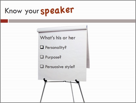
Technology certainly can help. The latest version of PowerPoint (2007 for Windows, 2008 for Mac) includes a small but versatile collection of high quality stock photos. A cropping function and other formatting tools add even more variety. Take the flip chart photo for example. It’s easy to pop it onto a slide, resize it and then use it to frame bullets. It sure makes the text more interesting to look at.
PowerPoint for Mac 08 also allows users to access their personal photo collection. And it automatically sizes the images to fit the slide layout. So, if you are handy with a camera, you can always import your own pictures into your slides. Just be careful when you capture images of people. If they can be easily identified, you should get permission to use the shots.
Avoid the overused clip art that PowerPoint provides – or cheap clip art from any source, for that matter. It simply does not send a business-like message to the audience.
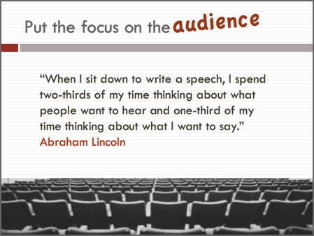
While I was strolling through an art gallery in Washington DC awhile back, I overheard a tour guide explaining a technique favoured by the Dutch masters. She said they would paint the subject (the scene of ships in a harbour for instance) in the bottom third of the canvas. Then they would fill the upper two thirds with sky and clouds. That approach gave me an idea for making text slides more interesting. I now look for graphics that I can use to frame the bottom of my slides to ‘set the mood’ for my message. For example, I often use a graphic of empty auditorium seats to frame the slides I use when I talk about how to bring the audience into a presentation.
These examples illustrate the ideas described in this article.
The solution is to design slides that are so simple people can absorb them quickly and return to listening to the presenter. After all, the presenter should be the focus of attention. What he or she has to say is the point of the presentation. The visuals are merely meant to serve as illustrations.
Nancy Duarte, whose company created the presentation slides that Al Gore used in his film An Inconvenient Truth, says that good slide design should follow the principles reflected in billboard ads. Take a look next time you drive along the highway and notice how billboards display a combination of bold graphics and simple text. It doesn’t take much time or effort to get the message as you zoom by.
A common complaint among presentation writers is that they lack the skills and resources needed to produce great slides. Granted, there are limits to what you can achieve when time is tight, your graphic library is small and your artistic talent is even smaller. But chances are, no matter what the constraints, you can do better than making audiences read static text.
Technology certainly can help. The latest version of PowerPoint (2007 for Windows, 2008 for Mac) includes a small but versatile collection of high quality stock photos. A cropping function and other formatting tools add even more variety. Take the flip chart photo for example. It’s easy to pop it onto a slide, resize it and then use it to frame bullets. It sure makes the text more interesting to look at.
PowerPoint for Mac 08 also allows users to access their personal photo collection. And it automatically sizes the images to fit the slide layout. So, if you are handy with a camera, you can always import your own pictures into your slides. Just be careful when you capture images of people. If they can be easily identified, you should get permission to use the shots.
Avoid the overused clip art that PowerPoint provides – or cheap clip art from any source, for that matter. It simply does not send a business-like message to the audience.
While I was strolling through an art gallery in Washington DC awhile back, I overheard a tour guide explaining a technique favoured by the Dutch masters. She said they would paint the subject (the scene of ships in a harbour for instance) in the bottom third of the canvas. Then they would fill the upper two thirds with sky and clouds. That approach gave me an idea for making text slides more interesting. I now look for graphics that I can use to frame the bottom of my slides to ‘set the mood’ for my message. For example, I often use a graphic of empty auditorium seats to frame the slides I use when I talk about how to bring the audience into a presentation.
These examples illustrate the ideas described in this article.