
Let the Rule of Thirds Be Your Guide
04/12/08 15:16 Filed in: Presentations
Graphic designers and photographers rely on a lot more than raw talent to compose their work. They make use of the rule of thirds. Actually it isn’t really a rule. It’s a guideline based on the idea that compositions are most pleasing to the human eye when the main elements fall on or near the four crossing points of a nine box grid.
The only tool you need to apply the rule is a grid. You can make one in PowerPoint or Keynote by arranging lines and circles until you have nine rectangles on a slide. As digital photo expert Lesa King says, divide your slide up so that it resembles a tic–tac-toe board. My slides look a lot better since I discovered the rule. Now, whenever I begin working on a new presentation, I include a grid slide.
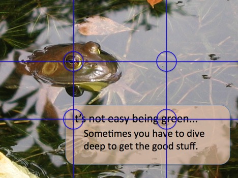
When I want to apply the rule, I simply copy the grid onto the slide I’m working on. Then, I arrange graphic and text elements until I’m happy with the composition. See the example below, which is a slide I use in my presentation writing workshops and seminars to illustrate the discussion about the importance of asking good questions when interviewing subject matter experts.
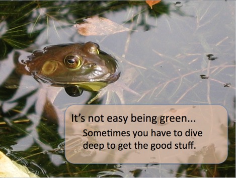
Once I’m happy with my arrangement, I delete the grid and le voilà, another pièce de résistance!
The only tool you need to apply the rule is a grid. You can make one in PowerPoint or Keynote by arranging lines and circles until you have nine rectangles on a slide. As digital photo expert Lesa King says, divide your slide up so that it resembles a tic–tac-toe board. My slides look a lot better since I discovered the rule. Now, whenever I begin working on a new presentation, I include a grid slide.
When I want to apply the rule, I simply copy the grid onto the slide I’m working on. Then, I arrange graphic and text elements until I’m happy with the composition. See the example below, which is a slide I use in my presentation writing workshops and seminars to illustrate the discussion about the importance of asking good questions when interviewing subject matter experts.
Once I’m happy with my arrangement, I delete the grid and le voilà, another pièce de résistance!